
A dashboard redesign for better performance and user experience
Year
2024
Platform
Web App
My Role
UX Research, UX Design, UI Design
Company
Asaan Retail
Background
SAAS startup revolutionizing B2B E-commerce Management in Southeast Asia. Asaan Retail offers an all-in-one solution, meticulously designed to manage inventory, orders, accounting, and shipments, thereby simplifying the complexities of digital commerce. With an impressive roster of over 200+ B2B clients, our services extend across a diverse range of industries, including retail, e-commerce, direct-to-consumer (D2C), marketing agencies, and third-party logistics (3PL), testament to it's versatility and wide-reaching impact.
Problem Statement
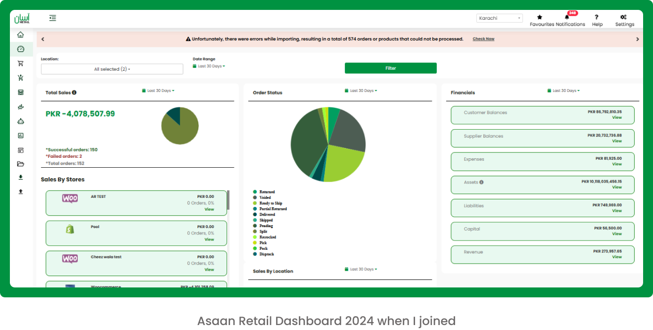
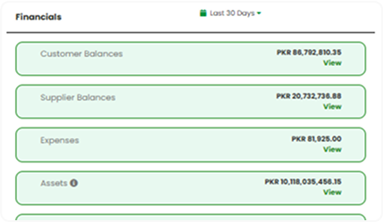
When I joined Asaan Retail, the existing dashboard presented significant usability challenges. The interface was cluttered, visually unstructured, and lacked a clear information hierarchy, making it difficult for users to navigate. Essential data—such as sales metrics, courier performance, and financial summaries—were either missing or poorly organized, often crammed into a single view. This not only overwhelmed users but also hindered their ability to access relevant insights and track operational performance efficiently. The absence of a user-centric design and contextual segmentation led to confusion, reduced productivity, and a frustrating user experience.
Research
Before exploring potential solutions, it was essential to develop a deep understanding of our users and the challenges they faced. To achieve this, we conducted user interviews with both active users and those who had recently stopped using the platform.
The current dashboard feels overwhelming. Everything is crammed into one screen, and I often have to scroll or guess where to find the numbers I need. I mostly care about daily sales and delivery updates, but I have to dig through unrelated data to get that.
~ Zain Ul Haq - CEO of discounter.pk
I find it really hard to track my finances on the dashboard. There’s no clear summary of what I’ve earned versus what’s pending or deducted. I usually have to export reports or contact support for clarification. A separate finance section with just the key figures would save me so much time.
~ Muddabbir Ali - CEO of SCENTS N SECRETS
Usability Testing
To evaluate the effectiveness of the current dashboard design, we conducted usability testing with existing users. The results revealed several key issues: users struggled to filter and access relevant data, lacked clear visibility into their inventory status, and were often confused about how to navigate to detailed views—frequently clicking on dashboard cards expecting them to be interactive.
The Approach
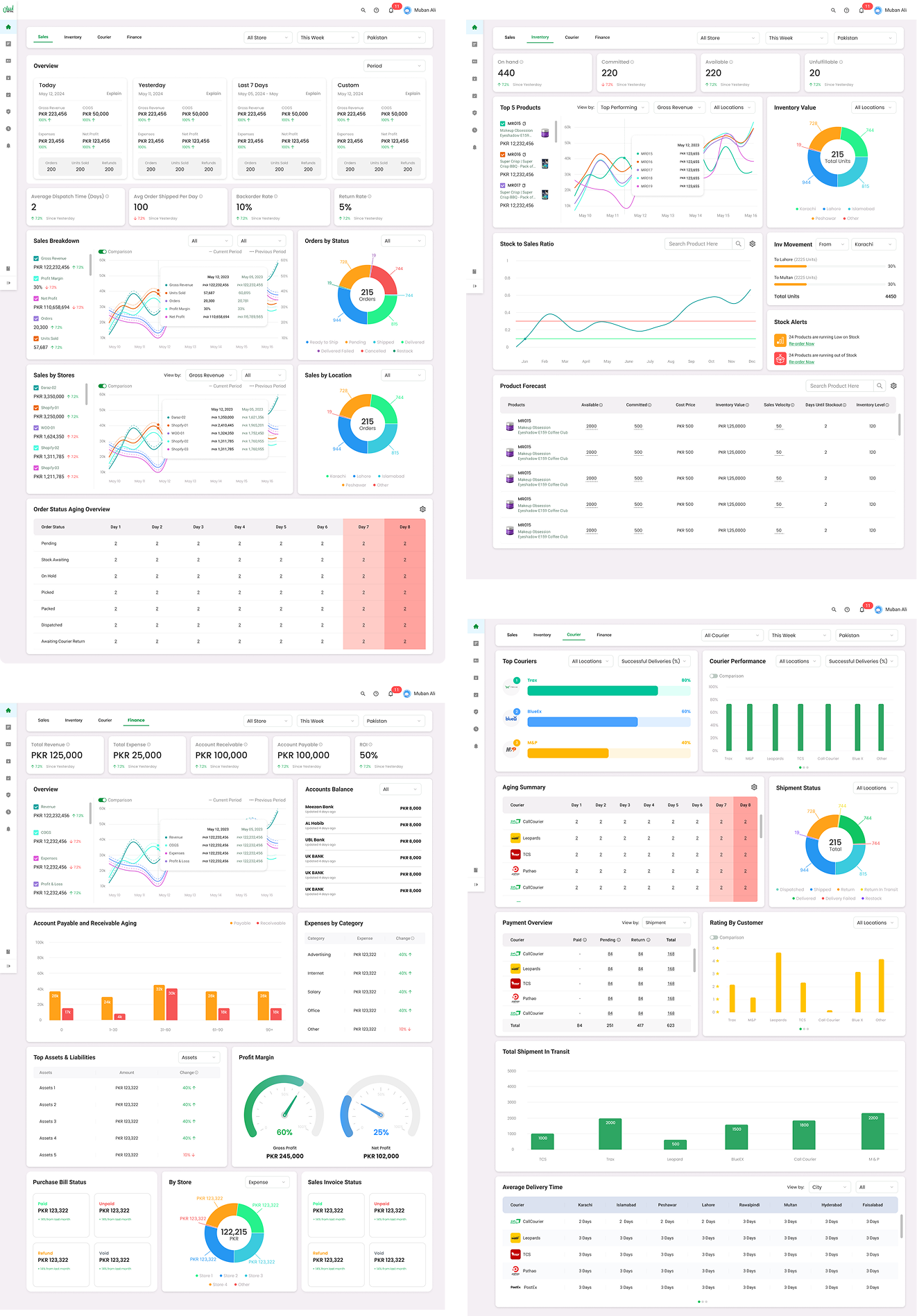
We began by conducting stakeholder interviews and analyzing how different teams (Sales, Inventory, Courier, Finance) use the dashboard. Based on user pain points and business needs, we proposed a modular restructuring of the dashboard into four dedicated sections:
- Sales
- Inventory
- Courier
- Finance
Each section was tailored to its team’s KPIs, helping reduce noise and allowing users to focus on the metrics that mattered most to them.
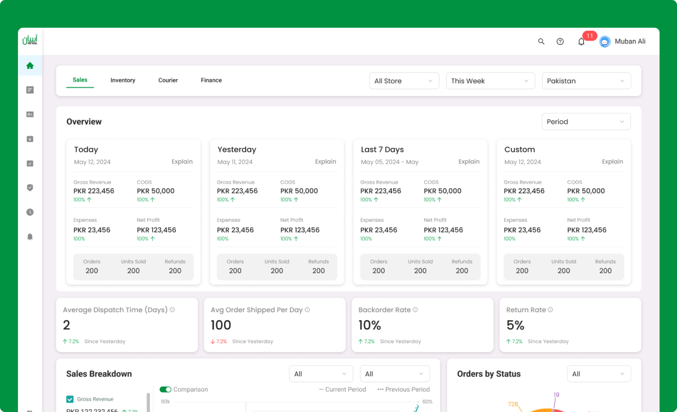
Solution
We restructured the dashboard into four focused modules—Sales, Inventory, Courier, and Finance—each containing only relevant widgets. This reduced clutter and helped users focus on their specific tasks. Widgets were redesigned for clarity, using clean charts, summary cards, and filters for deeper insights. We also enhanced the UX with a clear layout hierarchy, responsive design, and tooltips for better usability and comprehension
Outcome
After launching the redesigned dashboard, we observed significant improvements in usability and team efficiency:
- 🧠
37% Reduction in Time to Find Data
Users were able to focus faster with clearer, role-specific dashboards.
- ⚡
Improved Decision-Making Speed
Teams reported quicker analysis and more confident, timely decisions.
- 📊
Better Task Alignment Across Departments
Modular sections allowed each team to view only what mattered to them.
- 😊
Increased User Satisfaction
Users gave positive feedback on the simplified layout and improved clarity.
Learning
Reflecting on my experience as a Product Designer in this case study, here are concise key learnings:
User-Centric Design:
Emphasized the importance of basing decisions on user needs and feedback.
Design for Action, Not Just Visuals:
Each widget was built to drive decisions—not just look good—ensuring every component had a clear purpose.
Stakeholder Feedback is Crucial:
Engaging users early helped validate assumptions and align the design with real-world workflows.
Let's connect, share stories, and collaborate to learn and grow together.
© 2025 Hunzalah. All rights reserved.
Last updated on May 14, 2025.