
Improve the legacy warehouse management system
Year
2023-2024
Platform
Web App
My Role
UX Research, UX Design, UI Design
Client of
Shispare
Background
When I joined the shispare, sphereWMS was in the process of being redesigned to address usability issues and enhance the overall user experience. We have a team of 2 Designers 1 Product Owner and 1 Product Manager, the goal was to create a more intuitive and efficient platform that would empower warehouse teams to perform their tasks with ease and confidence.
Problem Statement
The existing system suffered from a poorly structured and unintuitive menu layout, leading to a disorganized and inefficient user experience. Users found it difficult to navigate due to the lack of clear menus and streamlined process flows, which significantly hindered productivity and overall satisfaction. Additionally, feedback from warehouse staff highlighted that the application was slow, and the tasks they needed to perform were often unclear and unnecessarily lengthy.
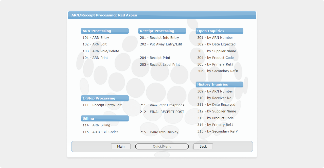
Menu before the redesign.
Approach
To address these challenges, we propose a comprehensive overhaul of the SphereWMS platform. We'll implement a user-centered design approach, focusing on an intuitive and streamlined interface with a logical menu structure. Clear workflows will guide users through tasks, minimizing wasted time and effort. This modernized platform will empower users, boosting productivity and enhancing user satisfaction.
Research
Before diving into potential solutions, we recognized the importance of deeply understanding our users and their specific challenges. To achieve this, we conducted user interviews with both active users and those who had recently stopped using the platform. Through this qualitative research, we identified critical pain points and areas of frustration. Our goal was to gather direct feedback and insights to inform our design decisions and ensure that the solutions we proposed would effectively address these challenges.
Q1. How long have you been using this system?
Q2. What are your goals when you use this system?
Q3. What problems do you want to solve through the app?
Q4. Are pickers, packers, and shippers technically proficient enough to use the scanner app?
Q5. What are the most time-consuming tasks in your daily operations?
Q6. What features do you find most useful in the current system?
Q7. Can you describe a typical workflow for receiving, storing, and shipping goods?
Q8. How do you train new employees to use the system?
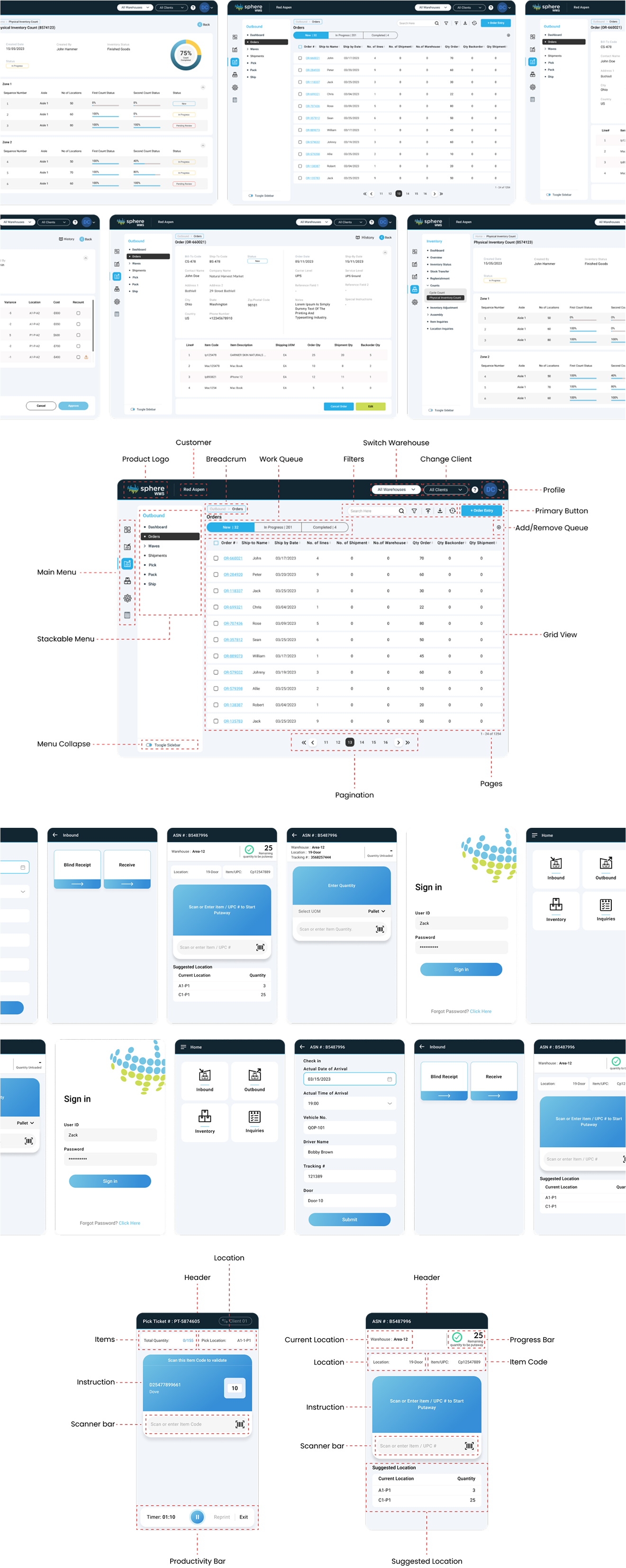
Implementation
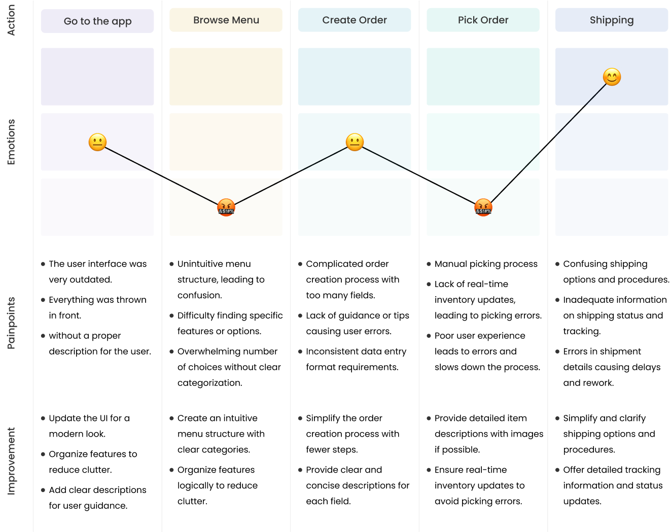
Outlining the step-by-step experience of a user interacting with the product, it highlights key touchpoints, emotions, and pain points throughout the user's journey.
We then conducted a card sorting exercise to restructure the menu, making it more intuitive and aligned with how users naturally group and access information.
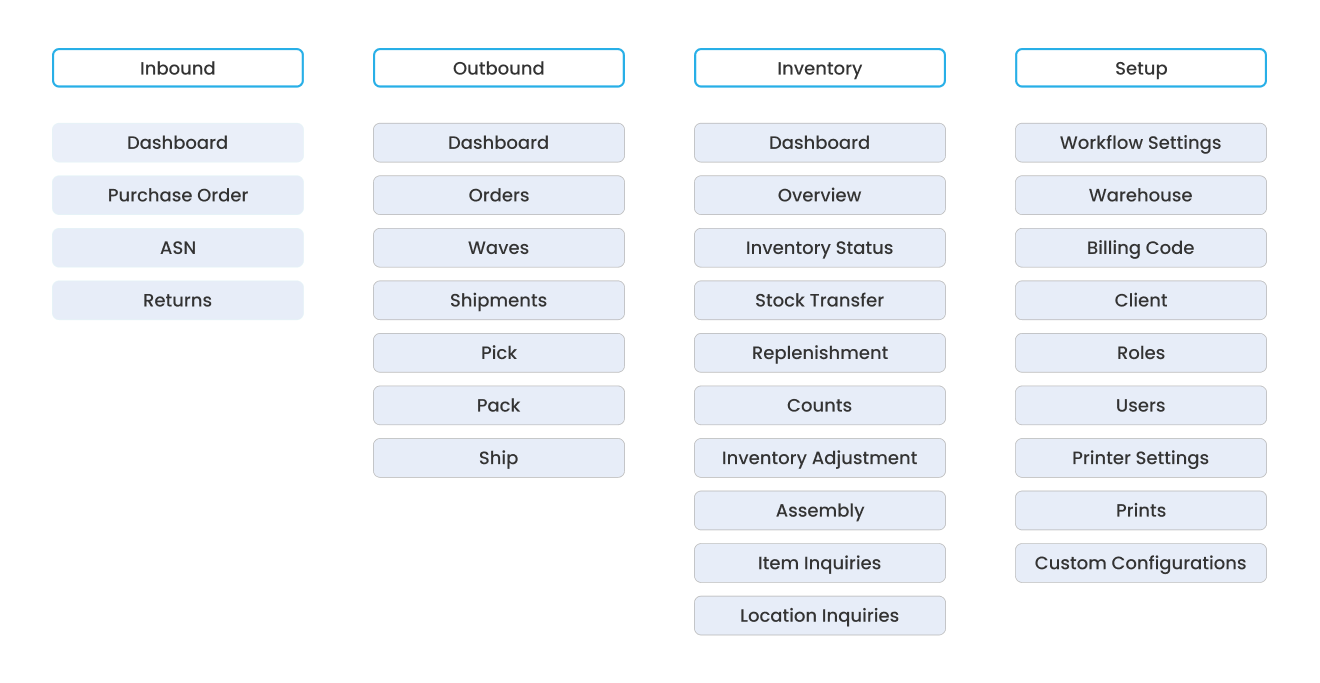
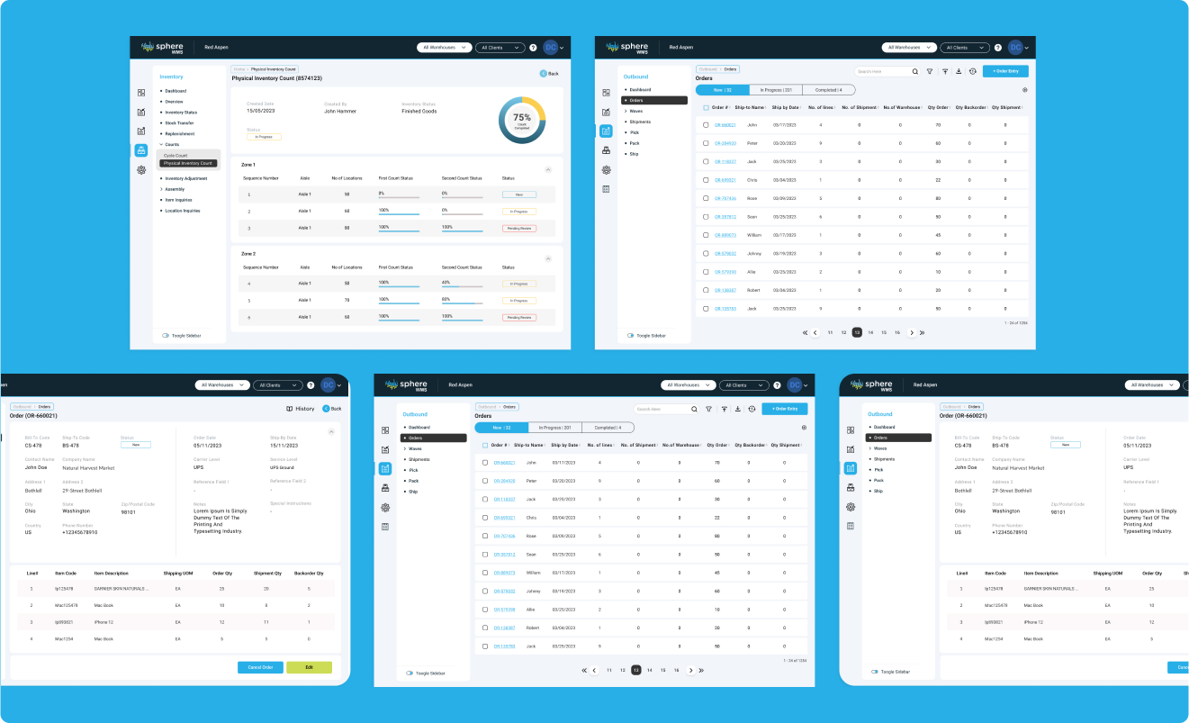
Menu after the redesign.
Solution
We proposed a comprehensive redesign of the SphereWMS platform, focusing on improving the user experience, enhancing navigation, and streamlining workflows. The solution was designed to overcome the challenges caused by the legacy system, disorganized menus, and inefficient navigation.
- Modular Dashboard Structure
- Intuitive Menu and Clear Process Flows
- Data Visualization and Improved Widgets
- Enhanced UX with Streamlined Navigation
- Mobile Application For Workers
- Enhanced UX with Streamlined Navigation
Each section was tailored to its team’s KPIs, helping reduce noise and allowing users to focus on the metrics that mattered most to them.
Outcome
After launching, we observed significant improvements in usability and team efficiency:
- 🧠
Enhanced UI Led to a 30% Increase in User Engagement
With a more intuitive and visually appealing interface, user engagement increased by 30%, as employees could access the information they needed more efficiently.
- ⚡
50% Faster Task Completion for Warehouse Workers
Warehouse workers completed tasks 50% faster due to the improved user flow, which reduced unnecessary clicks and streamlined workflows.
- 📊
Improved Decision-Making Speed
Teams reported a 25% improvement in decision-making speed, as real-time data visualizations and clear charts made it easier to assess performance metrics.
- 😊
Increased User Satisfaction
85% of users reported a higher level of satisfaction with the redesigned dashboard, appreciating the modern layout, better organization, and simplified tasks.
Learning
Reflecting on my experience as a Product Designer in this case study, here are concise key learnings:
Solving Real Pain Points:
I learned to treat pain points as clear guidance for smarter, more intuitive design decisions.
Redesign Requires Empathy, Not Just Aesthetics:
Starting from scratch taught me that meaningful redesigns come from deeply understanding user frustrations—not just making things look better.
Clarity Beats Complexity:
I learned that even feature-rich systems fail if users can’t navigate them easily. Simplicity in flow and layout is essential, especially in high-pressure environments like warehouses.

Shispare Team at their Annual Picnic in 2024.
Let's connect, share stories, and collaborate to learn and grow together.
© 2025 Hunzalah. All rights reserved.
Last updated on May 14, 2025.